Hi, I’m Godswill Iti. I hold a BSc in Psychology, a Professional Higher National Diploma in UX Design accredited by Glasgow Caledonian University, and a Level 4 Industry Certificate in Immersive Design using Unreal Engine.
With a research driven and iterative approach, I transform complex challenges into seamless, engaging experiences. Explore my work to see how I apply design thinking to create impactful solutions.
Blending creativity with functionality to deliver effective designs, I am passionate about pursuing a long term career as an HCI (Human-Computer Interaction) Specialist, designing innovative, user-centric solutions that bridge technology and human behaviour while collaborating on impactful projects.I’m passionate about crafting intuitive, user-centred digital experiences and developing high-fidelity visual systems. I bring immersive digital concepts to life through advanced real-time rendering, procedural effects, and virtual production workflows in Unreal Engine.
MY PROJECTS
UX, UXR & UI Design
User Experience, Research and Interface Design
Tools: Figma, MiroClick on image to view project details*
Designed and developed user-centred digital experiences through UX research, interaction design, and high-fidelity UI development. Applied research-driven methodologies including user testing, information architecture, and iterative prototyping to improve usability and engagement across digital products.
Developed skills in user experience research (UXR), wireframing, prototyping, interface design, design systems, accessibility, and usability optimisation, bridging research insights with intuitive and visually

UNREAL ENGINE
IMMERSIVE SYSTEMS & EXPERIENCE DESIGN
Tools (Unreal Engine)
Click on image to view project details*
Designed and developed immersive XR experiences in Unreal Engine, creating high-fidelity virtual environments through real-time rendering and interactive design. Developed expertise in 3D environment design, cinematic lighting, Blueprint scripting, optimisation, and virtual production workflows.
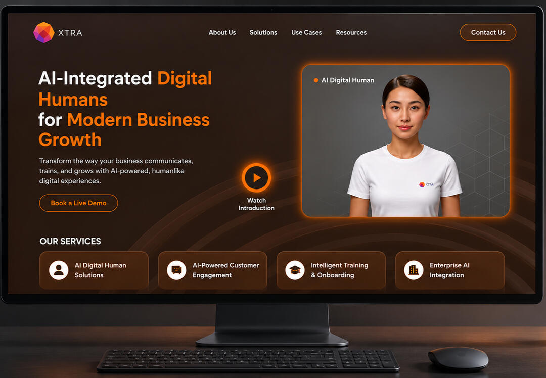
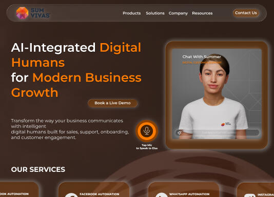
SUMVIVAS
(LANDING PAGE REDESIGN)
Tools: Miro, Figma
Click on image to view project details*For this project, I redesigned the SUMVIVAS landing page using a user centred design approach focused on improving visual communication, usability, and brand presence. The process involved research, content structuring, competitor analysis, wireframing, interaction design, and high fidelity prototyping to create a clearer and more engaging user experience.The redesign aimed to strengthen the landing page hierarchy, improve navigation flow, and communicate services more effectively through refined layouts, visual consistency, and responsive design principles.The final solution delivered a modern digital experience that enhanced user engagement, strengthened brand identity, and created a more intuitive journey across key touchpoints.
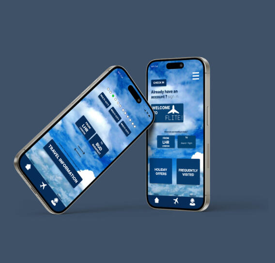
FLITE APP(AIRLINE MOBILE BOOKING APPLICATION)
Click on image to view project details*
Tools: Figma, MiroFor this project, I applied a user centred design approach to develop a mobile airline booking application focused on seamless flight search, selection, and booking. I conducted in depth research, user interviews, competitive analysis, wireframing, interactive prototyping, and usability testing to ensure clarity, efficiency, and confidence throughout the booking process.The solution was designed to simplify flight selection, pricing transparency, and booking management, delivering an intuitive and reliable travel experience for modern airline passengers.

STOKE ON TRENT CITY COUNCIL
BUYIT PROCUREMENT SAAS TOOL
Tools (UX Research Miro, Figma)
Click on image to view project details*
While primarily working as an E-Procurement Officer, I applied UX methods to enhance the Buy It procurement application by improving communication with developers and refining its information architecture. I introduced and led affinity mapping sessions, using insights from user journeys and team feedback to identify key pain points and improve the application's overall flow and usability.
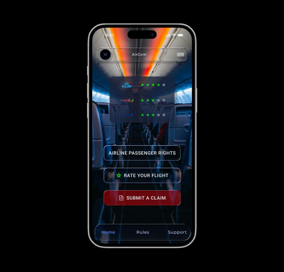
AIRCOM
FLIGHT COMPLIANCE & COMPANION APPLICATION
Click on image to view project details*For this project, I applied a user centred design approach to develop a flight compliance and companion application focused on safety, regulatory alignment, and seamless travel support. I conducted in depth research, stakeholder analysis, workflow mapping, wireframing, interactive prototyping, and usability testing to ensure clarity, accuracy, and ease of use across critical compliance processes.The solution was designed to simplify flight documentation management, real time status tracking, and passenger support features, delivering an intuitive and reliable aviation experience.
KEBULAN GRID
(Integrated Innovation Service Provider)
Click on Image to view Project details*
I guided the Kebulan Grid app from concept to execution by aligning product strategy with user needs. I led research, affinity mapping, and information architecture to define clear features and user flows. Working closely with designers and developers, I ensured smooth collaboration and delivered intuitive navigation and high-fidelity prototypes. My focus was on creating a scalable, user-centred solution that supports Kebulan Grid’s mission as an integrated innovation platform.
FLITE APP OVERVIEWThis project was completed as part of the UX Design Institute curriculum. The goal was to create a mobile application that provides users with a seamless travel booking experience. The project involved multiple rounds of research, analysis, wireframing, prototyping, and testing, and was completed over a period of six months.Timeline: Six monthsMy Role: Ux Design traineePlatform: Figma, Miro
PROBLEM SUMMARY
I identified the challenges faced by travellers, such as fragmented booking processes and unclear flight information. Conducted research to define the core issues that Flite App aims to solve, focusing on enhancing user convenience and satisfaction.SOLUTION SUMMARY
I developed a streamlined, user-friendly travel platform concept to address user pain points. The solution integrates booking, real-time updates. Visuals included journey maps and concept sketches.PROCESS
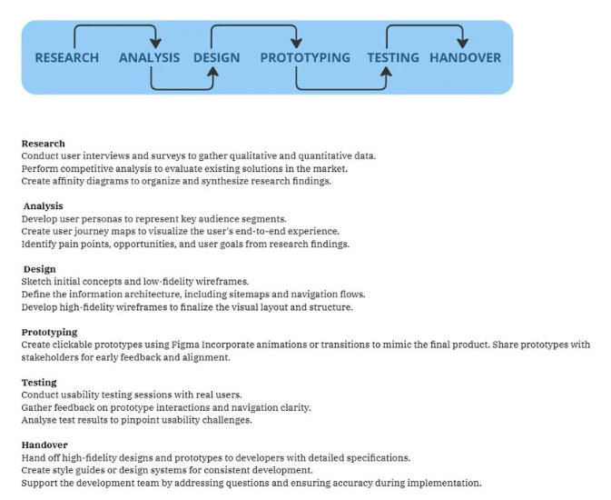
I began my UX process with in-depth research, conducting surveys, interviews, and competitive analyses to uncover user behaviors, needs, and pain points. I then synthesized these insights using affinity diagramming and journey mapping to craft detailed user personas and pinpoint critical friction points. With this foundational understanding, I advanced to the design phase, developing low-fidelity sketches and wireframes to establish a clear structure and intuitive navigation for the app. Finally, I transformed these concepts into interactive, high-fidelity prototypes, allowing for iterative testing and refinement to ensure a seamless, user-cantered experience.USER RESEARCH SUMMARY
I implemented a multi-method research strategy, leveraging surveys and in-depth interviews to capture nuanced insights into user behaviours, needs, and pain points. In addition, I conducted competitive benchmarking to analyse and compare the user experiences of leading travel platforms, identifying key strengths and weaknesses in their design approaches. Using modern analytical frameworks such as affinity diagramming and user journey mapping, I synthesized both primary research and competitive insights to pinpoint critical friction points—specifically, challenges with navigating flight information and fragmented integration across platforms. These findings directly informed our design strategy, ensuring a more seamless and intuitive user experience.
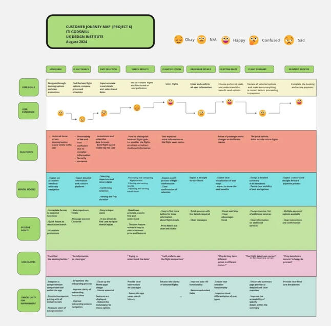
USER JOURNEY MAP
I conducted usability tests with participants representing our key user segments including business and leisure travellers and integrated competitor app analyses to benchmark industry standards. This approach enabled me to map out the end-to-end user journey, identify critical touchpoints, uncover opportunities for enhancement, and pinpoint potential friction points, ultimately guiding our iterative design improvements
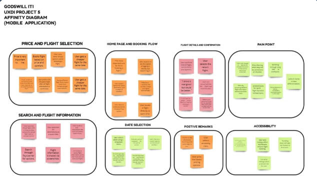
AFFINITY MAPPINGI conducted affinity mapping sessions to organize user insights and team feedback into meaningful groups. These insights informed the site map and navigation structure, helping create a clear, intuitive information architecture that reduces cognitive load and improves the overall user experience.
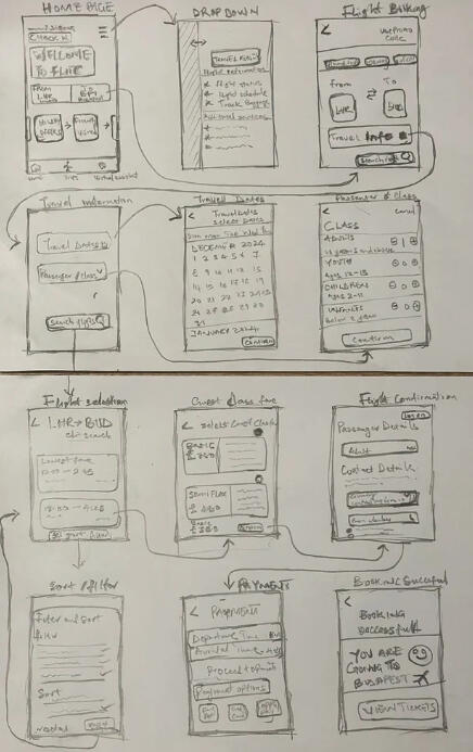
PAPER WIREFRAMES
I sketched initial low-fidelity wireframes to conceptualize the app's structure and layout. Focused on establishing a clear navigation flow and easy access to core features such as flight booking and notifications.
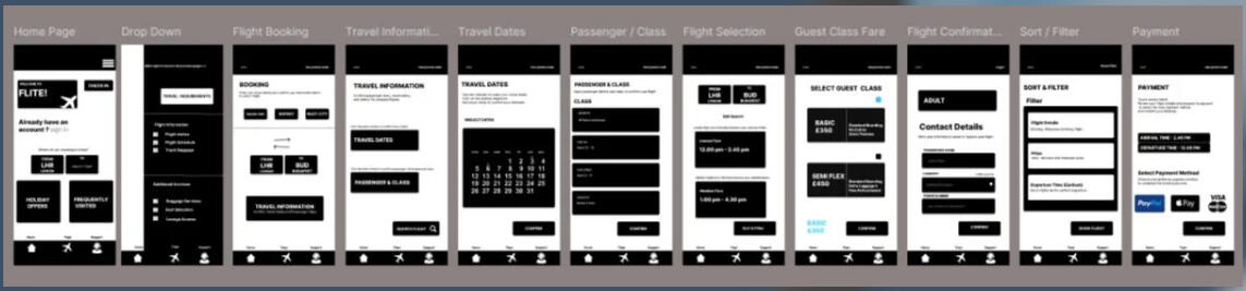
DIGITAL WIREFRAMES & LOW FIDELITY PROTOTYPE
I translated paper wireframes into digital formats using Figma. I Refined the layouts and added detail to ensure logical navigation paths and clear visual hierarchy.
HIGH-FIDELITY PROTOTYPE
Designed polished, visually appealing prototypes incorporating branding, typography, and colour schemes. Focused on creating a professional, user-friendly interface that aligns with the app's purpose.
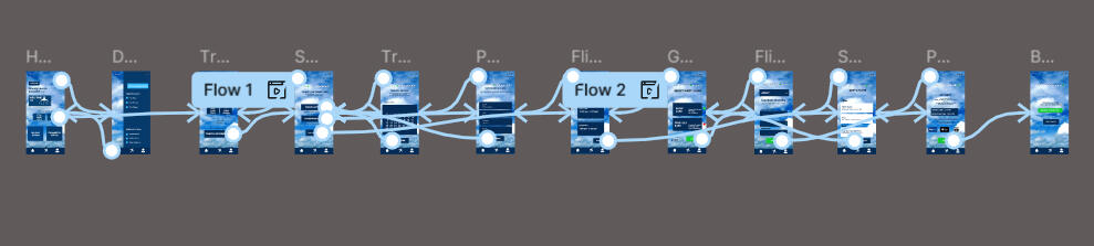
ANNOTATION & HANDOVERTo ensure a smooth transition from design to development, I created detailed annotations that clarify user interactions, design rationale, and functionality. These annotations provide developers with essential insights into key elements such as navigation flows, micro-interactions, accessibility considerations, and responsive behaviors. By documenting design decisions, I aimed to maintain consistency and usability across all touchpoints.
BUY IT!Procurement SaaS PlatformPROJECT OVERVIEWBuy It is a Procurement SaaS platform built for local councils to manage purchasing processes with greater efficiency, transparency, and control.The platform enables:Procurement officers to manage supplier engagementDepartment heads to raise and track purchase ordersFinance teams to monitor budgets and approvalsCouncils to maintain compliance with public sector procurement standardsTimeline: 12 MonthsRole: Digital Procurement Specialist & UX ResearcherPROBLEM SUMMARYLocal councils experienced inefficient and fragmented procurement workflows.Key challenges included:Manual and delayed approval chainsLimited visibility across procurement activitiesFragmented systems and unclear supplier dataCompliance risks and weak audit traceabilityBudget tracking inefficienciesI led research to uncover critical usability gaps, approval bottlenecks, and traceability issues within public sector procurement systems.SOLUTION SUMMARYDesigned a clear, user friendly order status flow to streamline procurement processesGathered and analysed recurring user queries to identify systemic friction pointsCollaborated with developers and senior management to automate key workflowsApplied affinity mapping and continuous user feedback to ensure research driven improvementsImproved system usability, transparency, and compliance oversightPROCESS
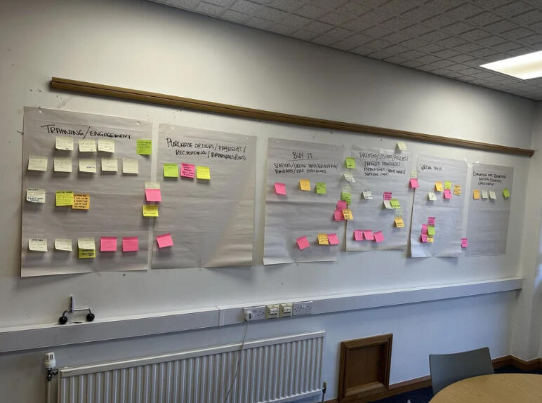
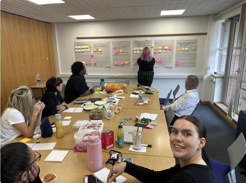
Affinity Mapping & Stakeholder CollaborationFacilitated affinity mapping workshops with cross functional stakeholdersCaptured and categorised user queries, operational pain points, and workflow inefficienciesGrouped findings into clear thematic clustersIdentified targeted service improvements for each issueSupported evidence based decision making and continuous optimisationThis structured, research led approach strengthened procurement efficiency, improved approval visibility, and enhanced overall system reliability within a complex public sector environment.
CONCLUSION
The affinity mapping session proved to be a valuable collaborative exercise that not only surfaced key user concerns and operational inefficiencies but also enabled the team to distill complex feedback into clear, actionable themes. By organizing insights into structured categories, we were able to prioritize issues based on impact and feasibility, leading to the identification of targeted service improvements. This process fostered cross-functional alignment, enhanced visibility into user and process pain points, and laid the groundwork for data-driven, continuous enhancements within the procurement workflow.
PROBLEM SUMMARY (2)
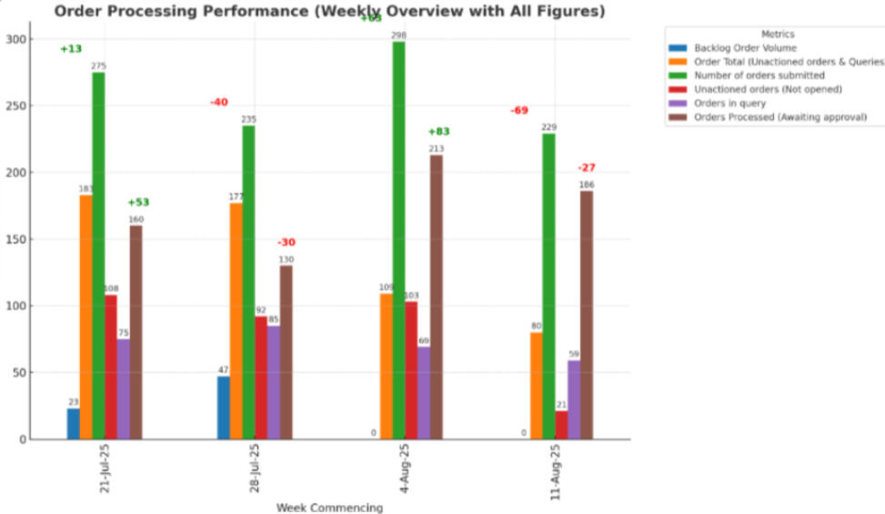
Weekly reporting was cumbersome and not user-friendly, which often led to unclear explanations from the manager to both the team and the Directors. After conducting a brief interview with the manager, I identified that the reports could be better communicated through visualisation, making them easier to present and understand.

PROCESS & SOLUTION SUMMARY
After conducting a series of interviews with the manager and key stakeholders, we identified that the main challenge with weekly reporting was the lack of clarity and user-friendliness in the way information was presented. To address this, we redesigned the reporting process by introducing data visualisation.The reports were broken down into clear, colour-coded categories, making it easy to distinguish priorities and performance areas at a glance. In addition, we transformed complex data into graphical representations, such as charts and trend lines, which provided a more intuitive and engaging way to communicate results.This approach not only simplified the manager’s explanations to the team and Directors but also improved overall understanding, alignment, and decision-making during weekly reviews.
Contact Me
If you’re interested in discussing a potential collaboration or opportunity, feel free to reach out. I’m always open to connecting and exploring how we can work together.
KEBULANGRIDAs Solutions Manager for Kebulan Grid, an integrated innovation service platform, I led the development of the Kebulan Grid app from concept to execution.
The platform connects innovators, creators, and businesses through a centralised, user friendly ecosystem that streamlines idea sharing, collaboration, and project management.
My role focused on aligning product strategy with user needs, ensuring the platform delivers a scalable, intuitive, and impactful user experience.Timeline: 4 Months
Role: Solutions Manager
Tools: Figma, MiroPROBLEM SUMMARY
Users experienced fragmented workflows when accessing innovation resources, collaboration tools, and project tracking features.Key pain points included:
Difficulty navigating between features due to unclear information architecture
Unintuitive onboarding and project management flows
Limited visibility into relevant content, connections, and actionable insights
Inconsistent interaction patterns leading to frustration and low engagementSOLUTION SUMMARY
Intuitive Navigation: Simplified information architecture with clear feature signposting
User Centred Flows: Streamlined onboarding, project creation, and collaboration processes
High Fidelity Prototypes: Developed polished, interactive prototypes for stakeholder buy in and development guidance
Scalable Design Framework: Established reusable components and consistent interaction patterns to support future growth
Enhanced User Engagement: Improved accessibility, discoverability, and overall satisfaction through human centred designPROCESS
Conducted discovery research through surveys and interviews with aspiring innovators, digital creators, and early stage founders
Identified behavioural patterns, motivations, and structural gaps within existing innovation platforms
Synthesised insights using affinity mapping and customer journey mapping
Developed user personas to guide feature prioritisation and design direction
Created low fidelity wireframes to define platform architecture and navigation
Transformed wireframes into interactive high fidelity prototypes
Refined designs through iteration to ensure clarity, scalability, and alignment with Kebulan Grid’s innovation driven missionUSER RESEARCH SUMMARY
Conducted surveys, interviews, and competitive benchmarking of innovation and learning platforms
Identified recurring friction points including cognitive overload, poor tool integration, and unclear user progression
Applied affinity diagramming and journey mapping to synthesise findings
Designed a structured, integrated learn to build ecosystem focused on clarity and momentum
Delivered a focused, user centred innovation platform grounded in research driven decision making
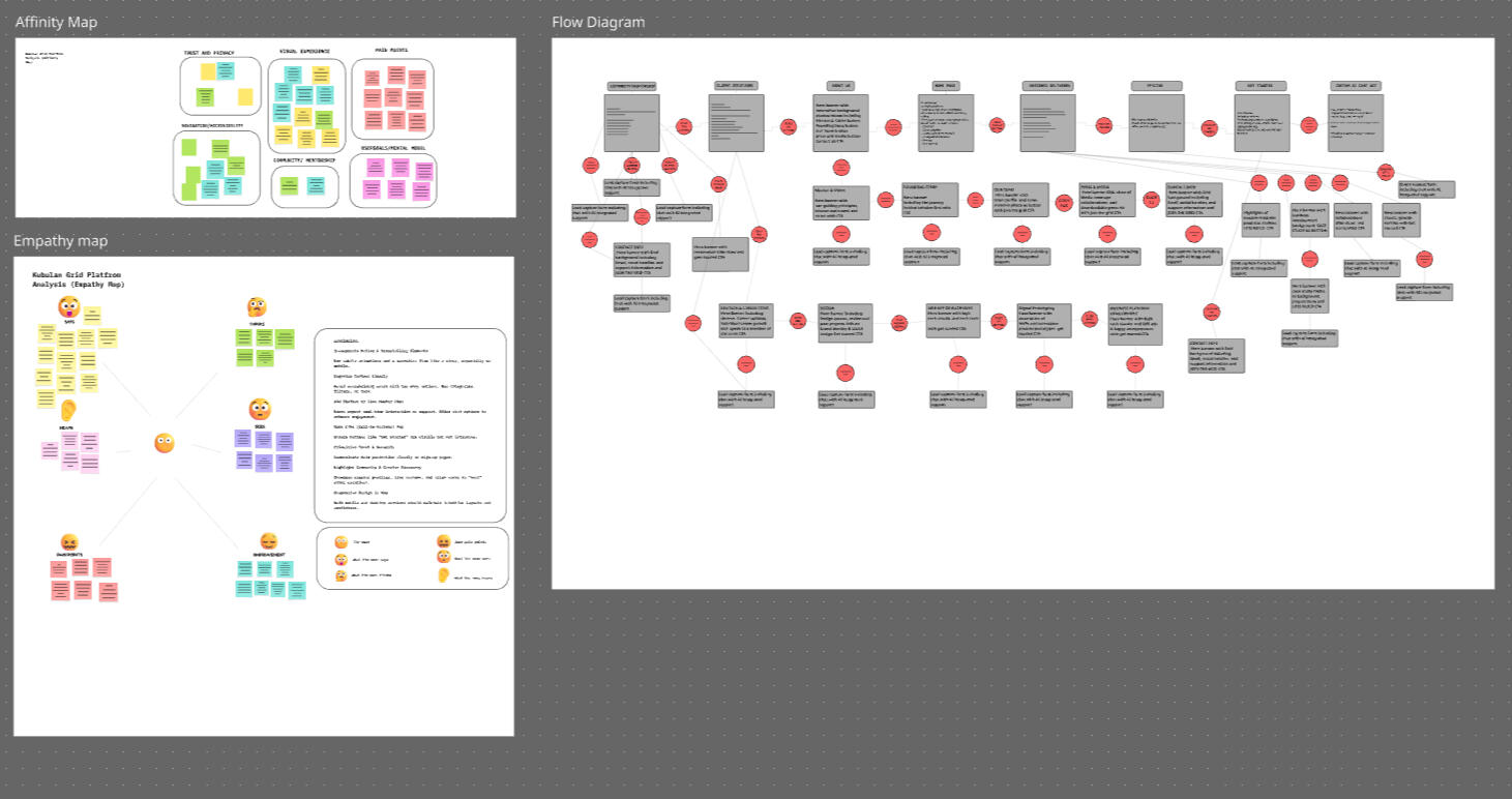
HIGH FIDELITY PROTOTYPE & HANDOVERTransformed validated wireframes into a polished, scalable digital systemDeveloped a cohesive visual language including typography, colour systems, spacing frameworks, and reusable component librariesEnsured consistency across the platform through structured design systems and interaction patternsBuilt an interactive prototype simulating real user flows, from onboarding to modular innovation pathwaysConducted usability testing and iterative refinement before developmentPrioritised clarity, accessibility, and structured progression to reduce cognitive overload and support a seamless learn to build experienceDeveloper HandoverDelivered organised design files with clearly structured componentsDocumented interaction states, behaviours, and responsive specificationsProvided reusable design assets to streamline implementationEnsured alignment between design intent and development executionMaintained visual integrity and functional performance as Kebulan Grid progressed toward build and deployment
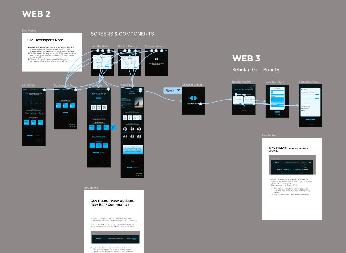
ConclusionThe development of Kebulan Grid resulted in a more structured and user focused ecosystem for innovators, creators, and businesses. By grounding design decisions in user research and behavioral insights, the project successfully addressed fragmented workflows, unclear navigation, and low engagement that previously hindered productivity within innovation platforms.Through the use of Figma and Miro, the final outcome delivered a scalable design framework, intuitive navigation, and streamlined collaboration flows. The platform now provides a clearer pathway for users to discover resources, share ideas, and manage projects efficiently.Ultimately, the project demonstrates the value of human centered design in building innovation driven products, ensuring that Kebulan Grid can continue to evolve as a flexible and impactful platform that supports creativity, collaboration, and long term growth.
AIRCOMFlight Compliance & Companion ApplicationOVERVIEWAIRCOM Flight is a compliance and companion application designed to streamline aviation regulatory processes while enhancing real time coordination and travel support.The platform focuses on:Reducing operational frictionImproving documentation accuracySimplifying complex compliance workflowsSupporting aviation professionals and travellers within one integrated systemPROCESS
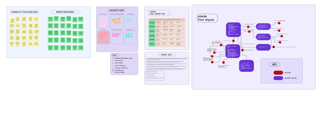
1. User ResearchConducted in depth user interviews and structured surveys with compliance officers, flight operators, and frequent travellersIdentified workflow inefficiencies and regulatory pain pointsExplored challenges in managing time sensitive documentation and approvalsKey insights uncovered:Fragmented compliance systemsCompliance related stress and uncertaintyLack of integrated support and visibility across platforms2. Research SynthesisApplied affinity mapping to identify patterns across different user groupsHighlighted issues such as information overload and manual documentation errorsIdentified inefficient cross platform coordinationThese insights defined the core feature set, prioritised usability improvements, and shaped the overall product direction.3. Customer Journey MappingDeveloped end to end journey maps covering pre flight checks, document validation, in flight monitoring, and post flight reportingIdentified friction points and emotional touchpoints across the compliance lifecyclePinpointed automation and simplification opportunitiesThis ensured the solution addressed both operational precision and user confidence within high responsibility aviation workflows.
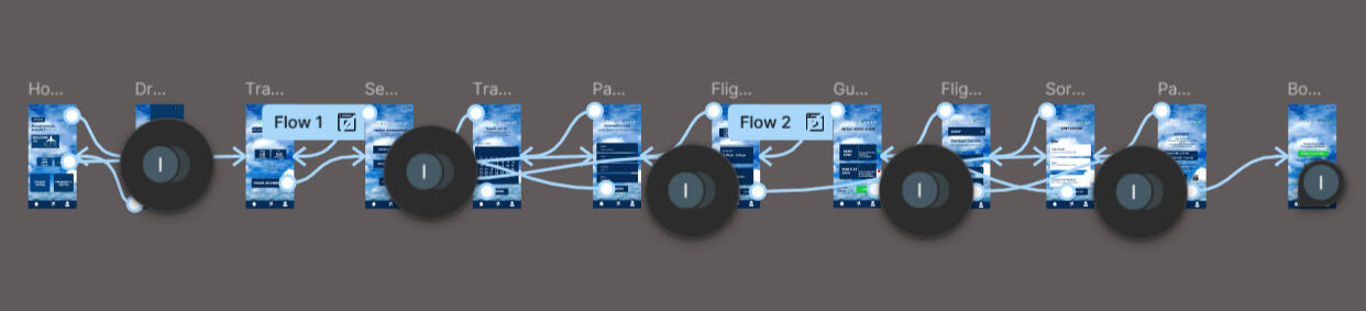
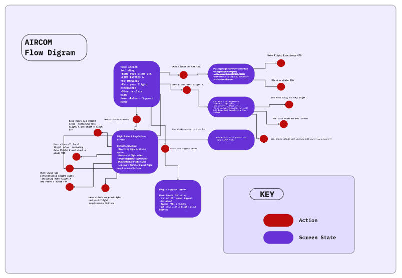
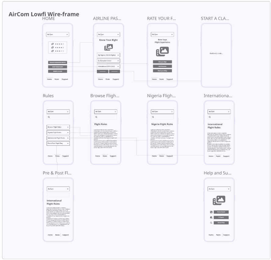
A comprehensive flow diagram was developed for the application to ensure users could access all flight rules, compliance information, and airline ratings within one integrated system. The structure was designed to clearly translate complex data into digestible insights, including dynamically organised rating information that highlights top rated airlines based on updated performance data. This approach ensured logical navigation, reduced cognitive load, and supported informed decision making within a single, streamlined platform.
WIREFRAMINGLow fidelity wireframes were designed to establish layout, hierarchy, and dashboard structure. The focus was on clarity, structured compliance tracking, alert systems, and intuitive navigation before introducing visual styling.
HIGH FIDELITY PROTOTYPE & HANDOVER
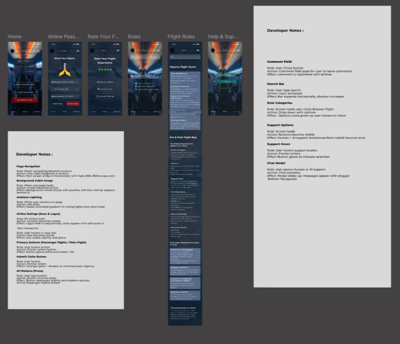
Wireframes were transformed into an interactive high fidelity prototype supported by a cohesive design system. Visual hierarchy, compliance status indicators, responsive components, and accessible interaction states were refined through iterative testing to ensure clarity and accuracy across critical workflows.For developer handover, I prepared organised design files with structured components, interaction specifications, responsive guidelines, and clear documentation to maintain consistency during implementation.The final solution delivers a streamlined, user centred aviation compliance and companion experience that balances precision, usability, and operational efficiency from design through to development.

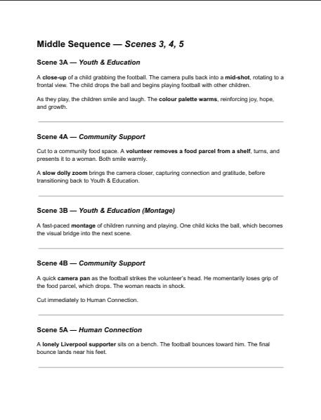
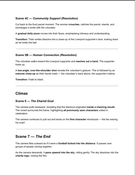
Short 3D Cinematic Animation for Everton FC
Unreal Engine Production BreakdownThis project involved the creation of a short cinematic animation developed for Everton FC using real-time rendering in Unreal Engine. The project was completed as part of a collaborative team effort, where we worked together to translate the client brief into a visually engaging short-form animation.The production pipeline included concept development, storyboarding, asset integration, previsualization, animation, lighting, VFX, rendering, and post-production.
Client Brief & Concept Development
The project began with analysing the creative brief provided for the Everton FC animation. The objective was to develop a short cinematic that captured the energy, identity, and atmosphere associated with the club.
Working collaboratively with the team, we defined the visual direction and narrative structure for the animation.Key considerations included:
Capturing the identity and visual style associated with Everton FC
Creating an engaging short cinematic sequence
Establishing mood and tone through lighting and environment design
Mood boards and visual references were developed using AI
Generated images at this stage.Script Development
A short narrative sequence was created to structure the animation and define the visual flow of the cinematic.
The script outlined key moments including:
An establishing environment shot
Character or camera movement through the scene
Visual focus on the club identity
A final cinematic revealThis script served as the foundation for the storyboard and animation planning.
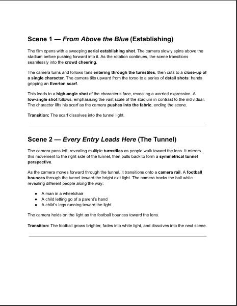
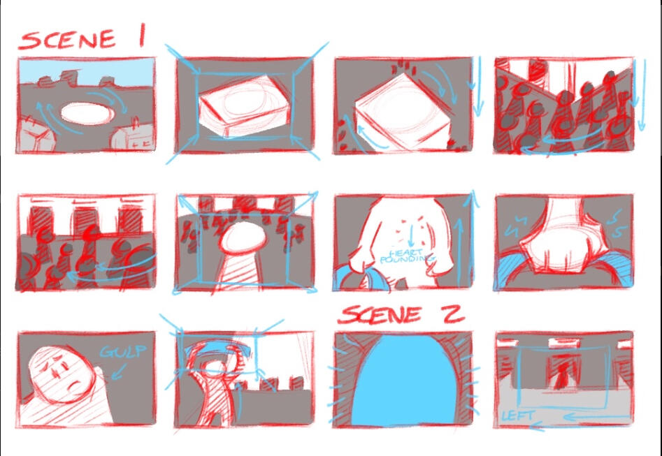
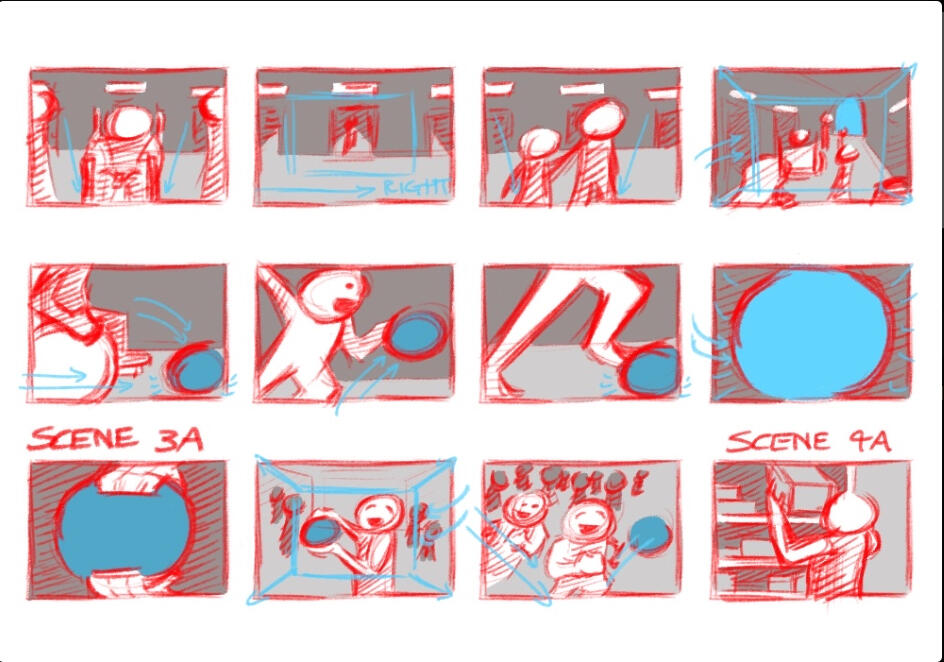
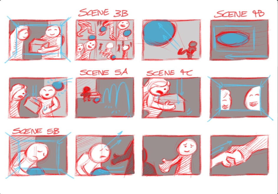
StoryboardingStoryboards were developed to map out each shot and visualize the progression of the animation.
This process helped the team plan:
Camera angles
Shot composition
Scene transitions
Character positioningBy visualising the sequence in advance, the team ensured that the narrative and pacing of the animation were clearly defined before production began.
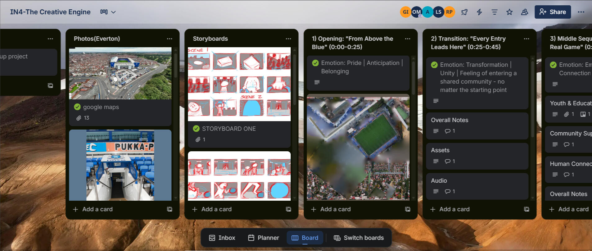
Asset Gathering & Preparation:
Assets required for the animation were sourced and prepared for integration into Unreal Engine.These included:
Environmental assets
Props and stadium elements
Textures and materialsAssets were sourced from platforms such as Quixel Bridge and Sketchfab and then optimized for use in the Unreal Engine environment.Working as a team allowed us to divide responsibilities efficiently, ensuring assets were properly prepared for the scene.Text
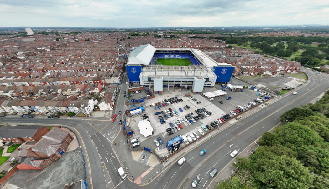
Scene Layout & Environment Setup:Using Unreal Engine, the environment was constructed by arranging assets and building the visual layout of the scene.This stage involved:
Environment assembly
Scene composition
Spatial layout
Initial lighting setupThe goal was to create a visually immersive environment that reflected the atmosphere associated with Everton FC.
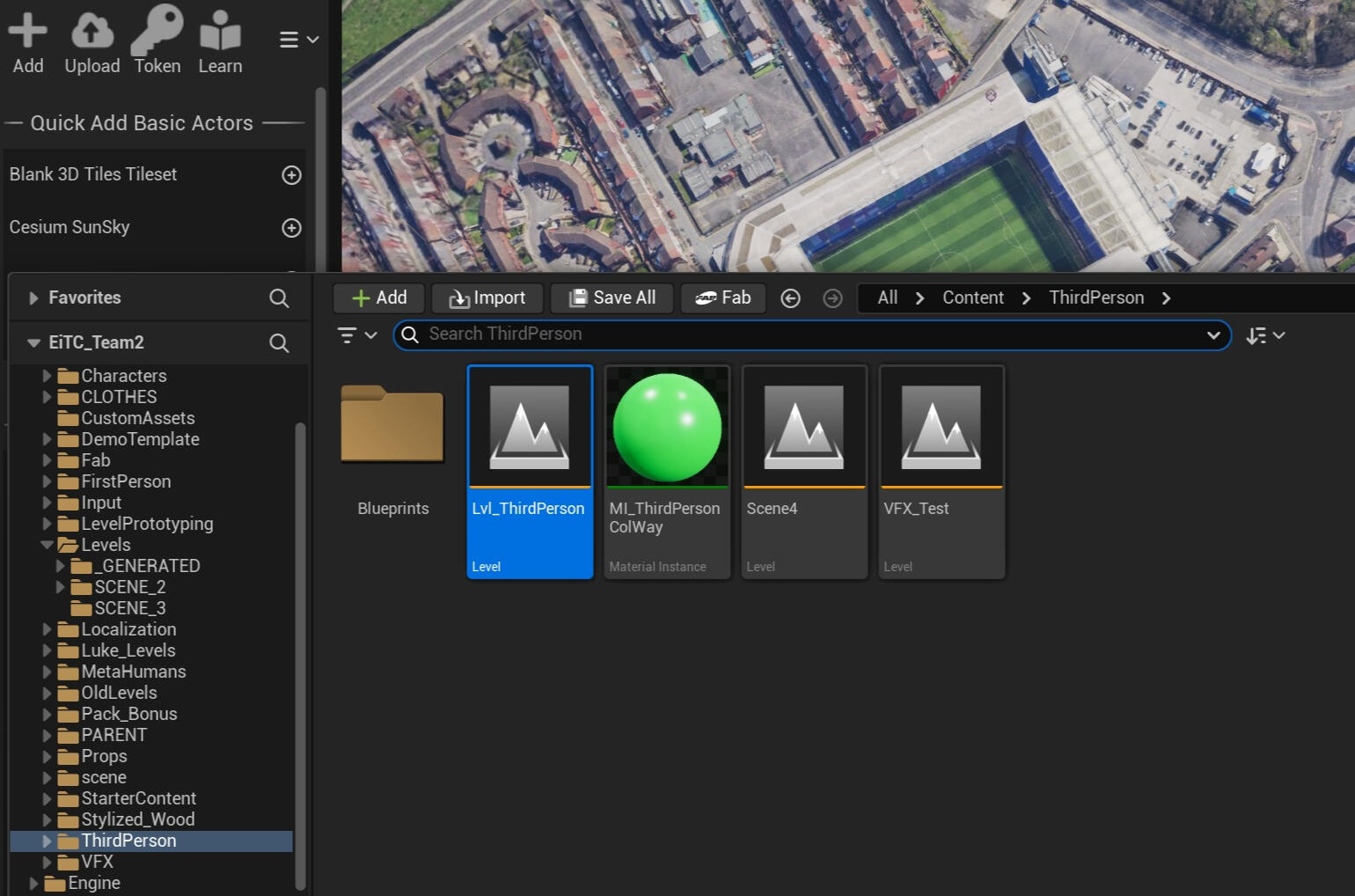
Previsualization (Previs)Previsualization was used to test the timing, pacing, and camera movements of the cinematic before final animation.
Using the cinematic tools within Sequencer, the team created a rough animated version of the scene.
This allowed us to review shot composition and make adjustments collaboratively before moving to the final animation stage.
AnimationDuring the animation phase, character movements, camera motion, and scene interactions were refined to bring the cinematic to life.Key tasks included:
Camera animation
Character or object movement
Shot timing adjustmentsAnimation was developed using Unreal Engine’s animation tools including Control Rig.Lighting Design:
Lighting played a critical role in creating the cinematic atmosphere of the scene.Lighting techniques included:
Directional lighting to simulate natural light
Accent lighting to highlight key elements
Shadow and depth control
The scene utilized Unreal Engine’s dynamic lighting system Lumen to achieve realistic illumination and reflections.Visual Effects (VFX):
Visual effects were introduced to enhance the energy and realism of the animation.
Effects such as atmospheric particles and environmental motion were created using the Unreal Engine VFX system Niagara.
These elements added depth and cinematic motion to the scene.Rendering: The final cinematic was rendered using Unreal Engine’s high-quality rendering pipeline through Movie Render Queue.Rendering settings were optimized to produce high-quality output suitable for presentation and portfolio use.Color Grading & Post-Production
Post-processing and color grading were applied to refine the final visual output and achieve a polished cinematic aesthetic.Adjustments included:
Color balance
Contrast enhancement
Film-style gradingSound Design:
Sound design was integrated to enhance the immersive quality of the animation.This included:
Background music
Ambient stadium or environmental sounds
Subtle cinematic sound effects
Audio editing and synchronization were completed using Adobe Audition.Outcome:
The final result was a short cinematic animation developed collaboratively for Everton FC, demonstrating my ability to work within a team environment and contribute to a real-time 3D production pipeline using Unreal Engine.This project highlights my understanding of the full animation workflow from concept development and storyboarding through to rendering, visual effects, and post-production.
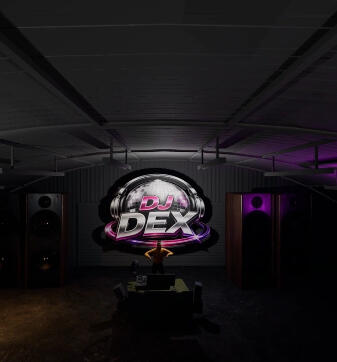
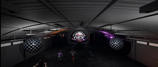
Project BriefReal Time Nightclub Environment for DJ Dex Live SetThis project involved the creation of a real time nightclub environment in Unreal Engine designed for large scale LED screen deployment during DJ Dex’s live music festival performance. The objective was to create an immersive visual experience that functioned as an extension of the live set, transforming the stage environment into a high energy visual performance driven by atmosphere, lighting, and cinematic composition.The creative direction centred around a disco inspired nightclub aesthetic, combining realism with subtle stylisation to maximise visual impact. The environment was designed to feel alive and performance led, with the DJ positioned as the central focal point of the scene through stage design, spatial composition, and lighting direction.The project scope included the development of a fully realised nightclub environment featuring:Detailed environmental design rich in atmosphere and spatial depth
Dynamic nightclub lighting systems including moving heads, strobes, and LED elements
Animated lighting behaviour triggered only during Play mode
Hero and cinematic environment cameras
Real time optimisation for immersive playback environmentsThe final deliverable consisted of a technically optimised Unreal Engine project capable of maintaining smooth real time performance while delivering a visually compelling environment suitable for large format immersive display systems.The project aimed to create a nightclub experience that felt like a visual performance alongside the music, balancing technical efficiency with spectacle and immersion.
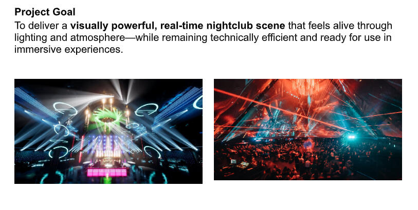
User Experience and Spatial DesignThe environment was planned from a user experience perspective, focusing on visual pathways, audience sightlines, stage composition, and focal hierarchy.Special attention was given to positioning the DJ as the dominant visual anchor through:Environmental composition
Lighting direction
Stage layout
Camera framingThis ensured the environment naturally guided viewer attention toward the performance.Unreal Engine Production PipelinePre visualisation and planning within Miro streamlined implementation in Unreal Engine, as interaction logic, camera sequences, lighting behaviour, and spatial structures were already validated before production.The environment incorporated:Dynamic nightclub lighting systems
Cinematic camera setups including hero and environmental shots
Real time optimisation strategies
Efficient asset and material workflows
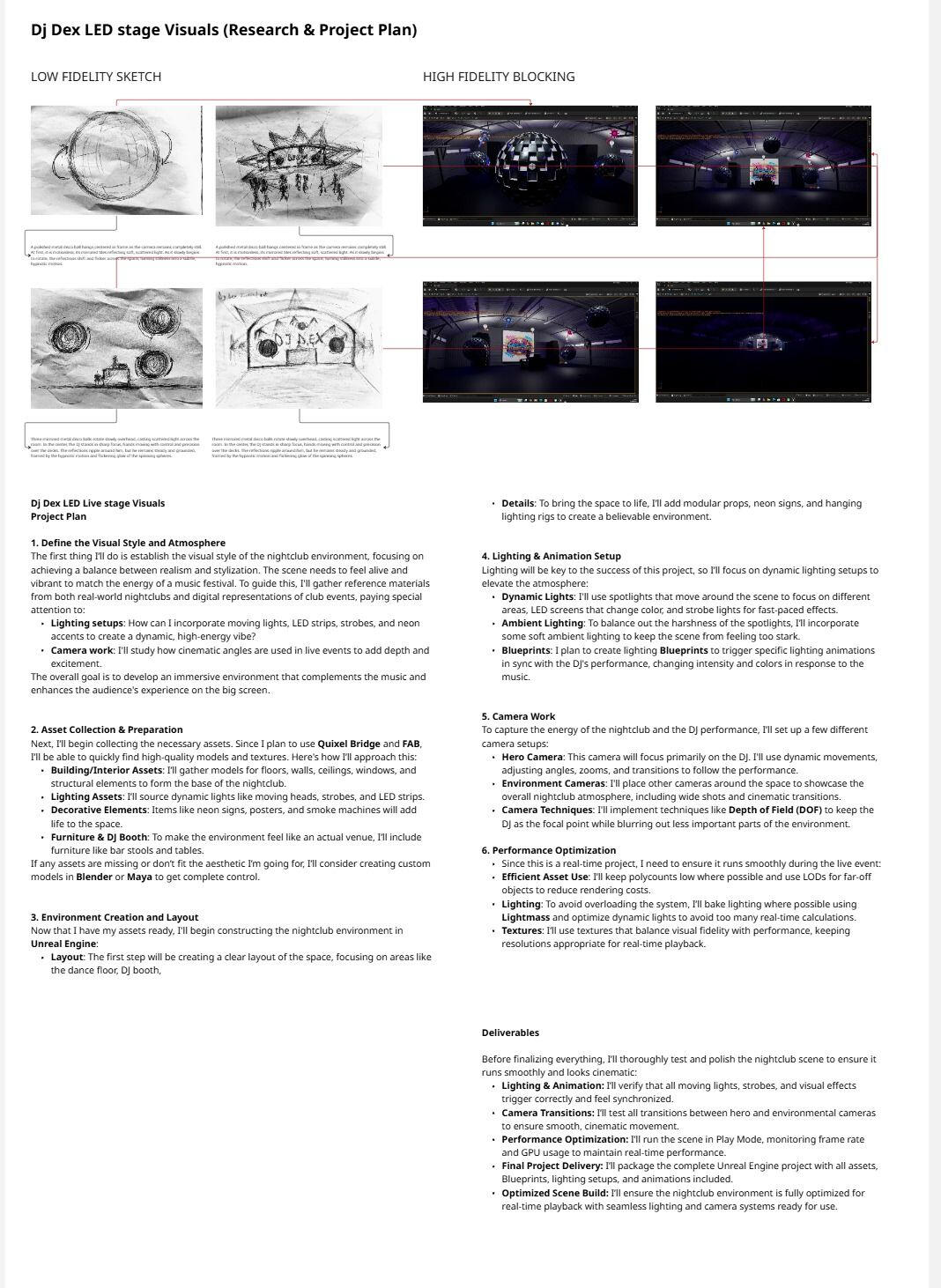
Spatial Planning and Collaborative WorkflowThe project utilised Miro as a collaborative planning and immersive design tool to structure ideas and spatial workflows before implementation in Unreal Engine.Rather than following a traditional linear production pipeline, Miro became the primary environment for mapping spatial layouts, scene hierarchy, interaction flows, camera positions, and lighting concepts.The process moved from low fidelity sketches and layout exploration toward high fidelity spatial blocking, enabling rapid iteration before production.ReflectionThis workflow demonstrates how collaborative planning methods can strengthen immersive production pipelines by bridging concept development, user experience design, and real time implementation, improving efficiency while maintaining creative quality in complex spatial environments.
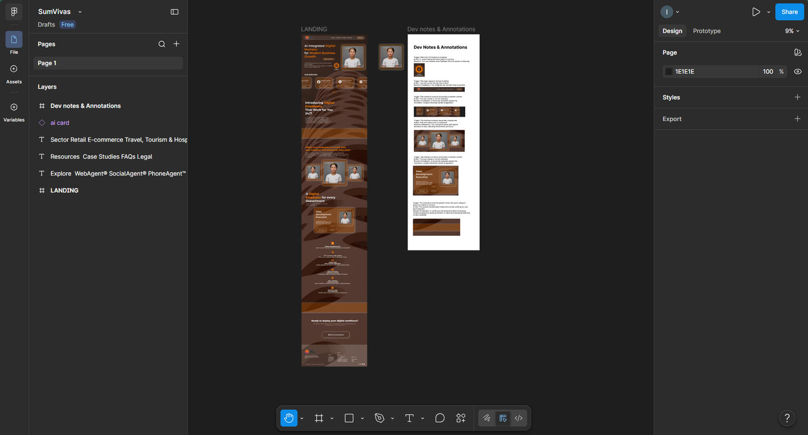
UX/UI Design Brief — Sum Vivas Website Redesign
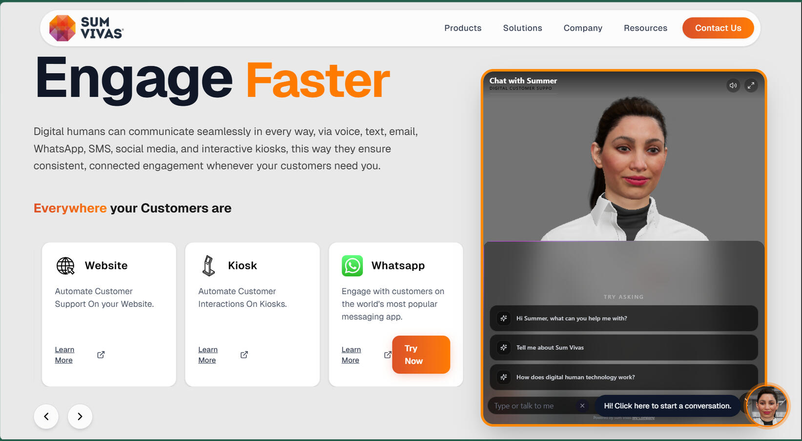
Project OverviewSum Vivas builds emotionally aware, hyper-realistic digital humans for B2B use cases, acting as AI employees across retail, hospitality, and customer service. Their product suite includes WebAgent™, SocialAgent®, PhoneAgent™, and SmartKiosk™. The platform enables 24/7 multilingual automation, reducing operational costs and improving conversion rates.The current website requires a redesign to better reflect the sophistication of the technology while improving clarity, trust, and conversion for enterprise users.ObjectiveDesign a modern, high-conversion B2B website in Figma that clearly communicates Sum Vivas as a leader in AI-driven digital human technology. The experience should balance innovation with usability, trust, and business impact.Target Audience
Business Leaders
Operations Managers
Customer Experience DirectorsFocused on scaling customer operations, reducing costs, and improving service efficiency while maintaining a human-like experience.
Key UX/UI Focus Areas
Hero Section: Clear value proposition with strong CTA (e.g., “Schedule a Demo”)
Value Metrics: Visually communicate key stats (cost reduction, uptime, conversion increase)
Product Navigation: Simplify discovery of WebAgent™, SocialAgent®, PhoneAgent™, SmartKiosk™
Trust & Credibility: Showcase client logos, partners, and case studies
Deliverables
UX structure and wireframes
High-fidelity UI (desktop & mobile)
Component-based design system
Micro-interaction notes
Developer-ready Figma handoff
OutcomeA conversion-focused, enterprise-ready UX/UI redesign that enhances trust, improves usability, and clearly communicates the value of Sum Vivas’ AI digital human platform.